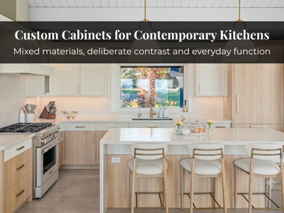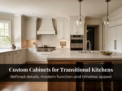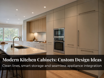
Most homeowners who ask us about two-tone kitchen cabinets already like the idea. The worry comes later. Once there are two cabinet colours, a veined countertop, a tiled backsplash, brass pulls and a wood floor, will anything in the room get to rest? Similar colour pairings can feel calm in one kitchen and scattered in another. The difference usually comes down to deciding where contrast belongs and what everything else does to support it.
Decide Where the Second Tone Belongs

Choose a location before choosing colours. Contrast placed in one clear zone reads as a decision. Contrast scattered around the room reads as indecision.
- Contrasting island, consistent perimeter: The island often stands apart physically, so its own colour tends to feel logical rather than added.
- Darker lowers, lighter uppers: This keeps visual weight low and the upper wall light. It suits long, uninterrupted runs best.
- Tall cabinetry in a separate finish: A wall of pantry and oven towers in wood or a deeper colour can read as built-in furniture.
Whichever you choose, let one tone lead. A clear visual hierarchy usually feels calmer than two tones competing equally.
Choose a Colour Relationship That Feels Intentional
Strong contrast creates an obvious focal point but asks more of the rest of the room. Related tones add depth without a hard break. It helps to know where the contrast is coming from:
- White with deep navy or charcoal: Contrast comes almost entirely from colour, so it works best in one zone, such as the island or lowers.
- Greige with warm off-white: A gentle tonal shift, so both tones can cover a lot of cabinetry without dividing the room.
- Warm white with natural oak: Colour and material contrast together, so the grain carries much of the effect.
- Soft neutral with walnut: Walnut’s depth draws the eye, so a muted painted tone around it keeps the balance.
Bold or subtle, check undertones. A cool grey beside a yellow-based cream rarely settles, even if each looks fine alone. View samples together, under your own lighting.
Pairing Painted Cabinets With Natural Wood
Sometimes the second tone is a material rather than a colour. Painted cabinets give a clean, controlled surface; natural wood adds grain, warmth and texture. Together they feel layered rather than busy because the contrast comes partly from material.
No species is universally better. Oak tends to feel lighter and more relaxed, and walnut richer and more formal. What matters most is the floor. A cabinet wood that neither matches your flooring nor clearly differs from it tends to look like a near miss.
Match the Contrast to Your Kitchen’s Size and Layout
A dark island that anchors a bright, open kitchen in Vaughan can feel heavy in a narrow semi-detached kitchen with one north-facing window.
- Smaller kitchens: Lighter uppers and related tones help keep the walls from closing in.
- Open-plan kitchens: A contrasting island can define the kitchen zone, while perimeter cabinets closer in tone to the living space keep the rooms connected. Condo kitchens often benefit from keeping that contrast restrained.
- Galley kitchens: Lighter uppers stop the space feeling enclosed, while richer lowers ground it.
In older Toronto homes with lower ceilings, lighter uppers help the wall recede. Whatever the layout, check samples in morning and evening light.
Coordinate Cabinets With the Rest of the Kitchen
Once cabinetry supplies the contrast, let one other surface be expressive and keep the rest calm.
- Countertops: Choose them alongside the cabinet colours. A stone with subtle hints of both tones can bridge them.
- Backsplash: Keep it simple when contrast is strong. Texture adds interest without adding colour.
- Hardware: Use one finish throughout, or two with a clear reason, such as matching the island’s tone.
- Appliances and walls: Stainless steel reads cool, which affects which painted tone sits comfortably beside it. Walls should support the lighter cabinet tone, not introduce a third idea.
Keeping a Two-Tone Kitchen Calm
Treat the kitchen as one composition. Every additional strong element needs a job. If you can’t say why it’s there, it probably shouldn’t be. Let one or two anchors, often the island and countertop, carry the interest so the rest can read as background.
Common Two-Tone Cabinet Mistakes
- Adding contrast on the island, uppers and a hutch at once.
- Mixing unrelated wood tones across cabinets, floors and shelving.
- Making the island dramatically different without checking how it reads from adjoining rooms.
- Choosing colours from trends alone. Trending kitchen cabinet colours can spark ideas, but your room’s light should have the final say.
Planning Two-Tone Cabinetry as One Design
Small samples rarely show how two tones behave across a whole room, which is why our 3D renders help at the design stage. With more than 25 years of experience and cabinetry built in North York, we plan our custom kitchen cabinets so colour, proportion and storage are resolved together.
Deciding between a wood island and a painted one, or unsure whether your countertop can handle two cabinet tones? Call us at 416-727-9795 to talk through your cabinet colours, finishes and layout with our team.