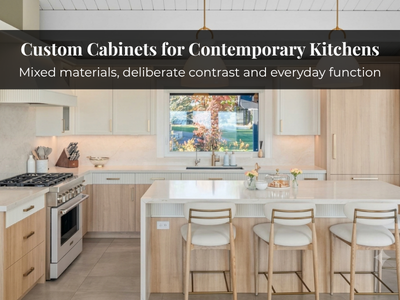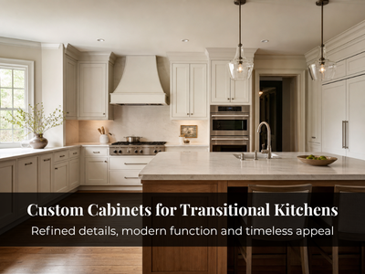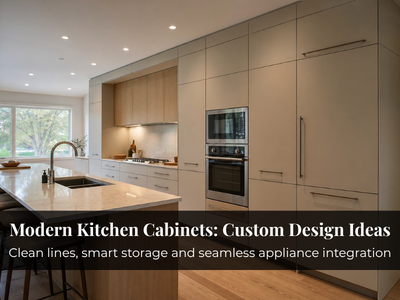
Cabinet colour is one of the few renovation decisions you can’t easily undo. Countertops can be swapped and hardware changed in an afternoon, but repainting or refacing custom cabinetry is expensive and disruptive. So before committing thousands to a finish, it helps to understand not just what’s popular in 2026, but which colours actually suit your kitchen, your light, and the way you live.
While warm neutrals and natural wood continue to dominate in 2026, bold colours like forest green and burgundy are increasingly being used as statement features rather than full-kitchen finishes. This guide walks through the shades Toronto homeowners are choosing this year, and more importantly, who each one is right for. Some are safe long-term bets; others are trend-driven and worth a second thought if you plan to stay put for a decade. Both are flagged along the way.
Neutral Tones: The Reliable Backbone

Neutrals stay popular as they’re the lowest-risk choice you can make. For anyone renovating to sell within a few years, or who simply doesn’t want to second-guess the decision later, this is a sensible place to start and they remain the most requested finish in Toronto custom kitchen cabinets.
1. Warm Whites & Soft Creams: These still do the heavy lifting, especially in smaller condo kitchens where a cool bright white can feel clinical. The warmth softens that. They bounce light around, make tight galley layouts feel larger, and pair with almost anything, from quartz to matte black fixtures. Worth knowing the difference: a warm white leans slightly brighter and cleaner, while a soft cream carries more yellow and reads cozier cream tends to hide fingerprints and splatter a little better, which matters if you cook daily or have kids. A practical consideration: white shows everything, so expect to wipe cabinet fronts more often than with a mid-tone.
2. Mushroom Taupe: It solves a common problem: wanting a neutral that doesn’t read as flat. Sitting between grey and beige with a touch of warmth, it works well for people drawn to organic or earthy kitchens, and it flatters natural wood grain and brushed metal. Unlike the cooler greys that dominated the late 2010s, it generally feels current rather than dated. If you liked grey but worry it’s on its way out, taupe is often the safer version of that instinct.
3. Dusty Green-Greys: Quiet enough to function as a neutral, but with enough colour to add depth. Best for transitional kitchens, the ones caught between traditional and contemporary — and paired with brass or matte black, they feel calm rather than cold. A good middle path for someone who wants “a bit of colour” without committing to a true green.
Rich, Saturated Colours: For Homeowners Ready to Commit

1. Deep Navy: Quietly one of the safest bold choices available, which sounds contradictory but holds up. It reads as a colour yet behaves almost like a dark neutral, so it tends to date more slowly than most saturated shades. It’s especially effective on an island or lower cabinets, grounding the room while uppers stay light. Navy handles both a roomy open-concept layout and a compact condo, and it works well with brushed brass, copper, light wood floors, or marble. For anyone wanting to move beyond neutral without gambling, this is often the first place to look.
2. Forest Green & Sage: These lean more clearly into personality, and it helps to treat them as two different decisions. Sage is the softer, more forgiving option for those who want calm and warmth, and it holds up in lower light. Forest green is deeper and more assertive — better in a kitchen with decent natural light, since it can feel heavy in a dim north-facing room. Works well with soapstone, butcher block, and matte tile, and both flex between rustic and contemporary depending on your hardware. Green has had a strong run for a few years, so it’s fair to ask whether it’s peaking, but the muted, earthy versions generally age better than punchier ones.
3. Burgundy & Oxblood: The boldest picks here, and worth being honest about: this is a statement, not a background. These deep reds bring warmth and drama, and look striking against light countertops with antique gold or brushed nickel. Keep in mind they’re polarizing — if resale is anywhere in your five-year plan, a full kitchen in oxblood can narrow your buyer pool. Where they shine is as a feature, on an island or a single run of cabinetry, where you get the impact without betting the whole room on it.
Pastels and Muted Tones: Soft Without Being Sugary

1. Sky Blue: Works best in kitchens that already get good light, where it feels open and calm rather than washed out. A natural fit for a coastal-leaning aesthetic, sitting comfortably with white counters, light oak accents, and stainless fixtures. In a darker space it can turn slightly grey and lifeless, so it’s worth testing a sample on your actual cabinets first.
2. Rose Dust: A dusty pink grounded with grey, which keeps it from feeling saccharine. A good option for someone who wants out of the all-white kitchen but isn’t ready for a bold colour. It handles brass hardware and white quartz well, and often works best on an island or lower cabinets rather than across every surface.
3. Mint Mist: A cool green-blue with a clean finish that suits minimalist, uncluttered kitchens. It’s subtle, a whisper of colour against matte white cabinets and light wood. Like the other pastels, it can read very differently under warm versus cool lighting, so check it against your bulbs before committing. One general note on pastels: they tend to be more trend-sensitive than neutrals or navy. If you love one, use it in a way that’s easier to change later — a section of cabinetry rather than the whole kitchen — or accept that it may feel dated sooner than a classic palette.
Two-Tone Cabinetry: Depth Without Overcommitting

Two-tone kitchens remain popular in 2026, partly because they let you enjoy a colour without going all-in on it. Splitting finishes across the room adds character and, done well, solves real layout problems which is why it’s such a common request in custom kitchen cabinetry.
1. Dark Base Cabinets with Light Uppers: The most useful version. Deep navy, charcoal, or espresso on the bottom anchors the space, while cream, soft white, or pale grey up top keeps things open. In a small city kitchen this genuinely helps drawing the eye upward and easing the heaviness a fully dark scheme can create.
2. Painted and Natural Wood Finishes: Mixing painted cabinetry with natural wood adds warmth and texture. Soft green or taupe against oak or walnut gives contrast that feels organic rather than stark. Best for homeowners who love wood but want something more current than an all-wood kitchen.
3. Contrasting Island Colours: The lowest-risk way to experiment. Painting just the island a bolder tone or a darker version of your main colour makes it a natural centrepiece and lets you bring in a trendy colour without living with it everywhere. If you’re tempted by burgundy or forest green but nervous, this is a good way to test the water.
Natural Wood Finishes: Warmth That Doesn’t Chase Trends

Wood has come back strongly, driven partly by interest in sustainable, longer-lasting materials and partly by fatigue with painted-everything kitchens. Its main advantage: real wood grain doesn’t date the way a specific paint colour can, which makes it a strong long-term choice.
1. White Oak: A light, clean look that fits Scandinavian-leaning and minimalist kitchens. It brightens a room without the coldness of stark white and takes matte black or brass hardware well. Pair it with light quartz or marble for an airy result. Forgiving, widely liked, and hard to go wrong with.
2. Walnut: If white oak is about lightness and calm, walnut is about richness and presence; oak tends to recede into a bright room, while walnut anchors it. It works well as a statement island or full-height pantry wall, and signals quality without any help from paint. Keep in mind: The cost and light: walnut is a premium material, and in a small or dim kitchen a lot of it can feel closed-in. Used as a focal point rather than wall-to-wall, it’s hard to beat.
3. Mixed Wood Tones: A walnut island with white oak perimeter cabinets, for example, gives a curated, collected-over-time look. It takes a careful eye to balance the tones so the result reads intentional rather than mismatched — the kind of detail a good cabinet maker in Toronto can help you get right. When it works, the result feels personal in a way a single finish rarely does.
Custom Colours: Built Around Your Space
More Toronto homeowners are skipping the standard palette entirely and matching cabinet colour to their specific light, layout, and finishes.
- Custom paint gives you full control over tone, sheen, and texture.
- Proper colour matching keeps cabinetry, backsplash, counters, and flooring working together instead of competing.
- A local cabinet maker adds real value here — translating what you like into a finish that behaves the way you expect once it’s on your walls, under your light.
Choosing the Right Cabinet Colour for Your Kitchen
This is the part that matters most, because the “best” colour depends heavily on your particular kitchen. A shade that looks incredible in a bright showroom can fall flat in a north-facing condo. Here’s how to think it through.
- Start with light. This is the single biggest factor people underestimate. North-facing kitchens get cool, flat light that can mute warm colours and make cool greys look drab, so warmer tones often work better there. South-facing rooms get strong warm light that can wash out pale shades and intensify saturated ones. Bulbs matter as much as windows — the same green can look fresh under cool daylight bulbs and muddy under warm ones. Test a proper sample on the actual cabinet doors, and look at it morning, night, and under your kitchen lights before deciding. Small paint chips can be misleading.
- Then consider size. Light colours generally make a small kitchen feel larger, which is why they dominate condos. Darker shades create a cozier, more enclosed feel — wonderful in a spacious kitchen, riskier in a cramped one. For a small space that still wants depth, that’s the case for two-tone or a dark island rather than dark everywhere.
- Think about how the kitchen connects to the rest of your home. In an open-concept layout the kitchen is visible from the living and dining areas, so the colour has to sit comfortably with that furniture and flooring, not just look good in isolation.
- Be realistic about maintenance. High-gloss and very dark finishes tend to show fingerprints, dust, and water spots most. Very pale finishes show food splatter and grime. Mid-tones and textured or matte finishes generally hide daily life best — which matters a lot if you cook often or have a busy household. It’s an unglamorous point you’ll appreciate every single day.
- Weigh trendy against timeless honestly. For a forever kitchen with a significant budget, it often makes sense to lean toward neutrals, navy, or natural wood on the expensive permanent cabinetry, and express personality through things that are cheaper to change later: hardware, a painted island, the backsplash, bar stools, wall paint. If another renovation is likely in 7-8 years, there’s more freedom to go bold. The regret that comes up most often isn’t choosing the wrong colour, it’s putting a short-term trend on the one element that’s hardest and priciest to change.
Planning a Kitchen Renovation in Toronto?
By this point you likely have a shortlist forming, and maybe a couple of doubts about how those colours will actually behave in your space. That’s normal, and it’s exactly the kind of thing worth talking through before committing.
At Magna Custom Cabinetry & Design, we build custom kitchen cabinets in Toronto and spend a lot of time helping homeowners pressure-test their colour choices against their real light, layout, and how they use the space. If you’d like a second opinion on a shade you’re considering, or you’re not sure where to start, we’re happy to talk it through.
Reach us at 416-727-9795 to book a consultation and see how your favourite kitchen cabinet colours and finishes would come together in your own Toronto home.